

Important Vastu Checks for New Home
Top 10 Critical Vastu Checks For Home The “Dream Home” or a Structural Trap? The Technical Audit of a Lifetime Buying a property is not
Let’s bypass the interior design glossy magazines for a moment: painting your home or office walls based on “seasonal color trends” is one of the most aesthetically pleasing ways to sabotage your life. Most people treat paint as a mere backdrop for their furniture, completely blind to the fact that color is not a static visual choice—it is raw, unadulterated electromagnetic radiation. Every single hue you paint on a wall vibrates at a specific frequency, bouncing light waves directly into your retinas, firing neural signals through your optic nerve, and altering your cellular chemistry.
Colors symbolize the absolute principle of living in harmony with the earth. When applied with mathematical alignment, they pacify a chaotic mind and stimulate sluggish energy; when misapplied, they act as an environmental toxin that affects your mood, health, structural stability, and domestic happiness. The impact of colors on your physical existence is total—it is emotional, intellectual, materialistic, physical, and intuitive. Real Colour Vastu is a rigorous, tech-focused discipline that maps these visual frequencies to specific earth coordinates. If your life feels like an uphill battle, stop blaming your horoscope and start looking at the paint swatches on your walls.
For any form known to exist in our tangible universe, it must possess color. Out of the vast, silent void of the universe come all material things, emerging through a complex cosmic blueprint. All permutations of life, from the massive macrocosm of galactic movements to the subatomic spin of a single cell, resound inside us. The invisible force that links our biological bodies with the physical walls around us is energy—or what the ancient architects termed the “cosmic breath.”
This energy is your non-biological self; it is your spirit, your psyche, your raw essence. Without it, human beings are merely flesh and bones waiting to decay. This breath is absolutely essential to maintaining physical, environmental, and emotional balance. In a very literal sense, this spatial energy acts as the structural blueprint of your personality, your talent, and your overall life course.
Harmony and balance are not poetic luxuries; they are survival mechanisms. Out of the deliberate balancing and harmonizing of positive and negative forces arises human energy—the most vital, defining feature of life itself. Human life is heavily conditioned by color because color is the language through which the Pancha Tattva (the five elements of nature) communicate with your environment.
Simply click on the button below, fill the attached details to get a detailed personalised e-horoscope with charts, predictions, and suggestions for absolutely FREE!
The five elements of nature—Air, Fire, Earth, Water, and Space—are responsible for generating both positive and negative energies within a building. These elements are not literal physical substances; they are cosmic powers or distinct essences that describe all matter and all psychological attributes.
In our advanced 16-zone analytical framework, these elements dictate specific directions, seasons, environmental movements, and the internal organs of the human body:
The Fire Element (South-East / South): Associated with the color red, the peak of summer, and the human heart.
The Earth Element (Center / South-West): Positioned squarely at the planetary core, standing for heavy yellow, rich oranges, and grounding brown tones. It rules the mid-autumn transition and coordinates with the liver and digestive grounding.
The Air / Wood Element (East / North-East): Resonates with green and light blue frequencies, spring growth, and the liver/gallbladder pathways.
The Water Element (North): Vibrates with deep blues and black, representing winter, the cold north vector, and governs the lungs, kidneys, and circulatory fluids.
The Space Element (West / North-West): Shapeless, colorless in its absolute state, yet manifesting as silver, gold, and pristine white. It effects the mind, cellular structural integrity, and the nervous system.
If you inject a clashing color into a specific zone, you aren’t just changing a room’s vibe; you are causing an energetic organ clash. Paint your North zone (Water) in a heavy Fire red, and you introduce an elemental friction that can manifest as chronic anxiety, financial liquidity freezes, or respiratory and circulatory strain among the inhabitants.
Colour Vastu is deeply rooted in ancient scientific treatises. The classical texts do not treat color as an afterthought; they list it as a core component of structural diagnostics.
The Brihat Samhita of Varahamihira, Chapter 53, Verse 92, explicitly dictates the relationship between color, light absorption, and the psychological health of the householder:
“A building whose walls, doors, and columns are adorned with the correct, radiant hues corresponding to their natural directional lords invites prosperity and mental clarity. Conversely, dark, chaotic, or mismatched colorations cause internal sorrow, physical depletion, and the rapid decay of wealth.”
Furthermore, the Vishwakarma Prakash, Chapter 2, Page 61, reinforces the biological necessity of balancing colors based on directional element maps:
“Let the wise builder apply white, yellow, red, and dark tones only where the elemental rulers of the directions permit. If the place of fire is painted in the colors of water, or if the place of the treasury is darkened with the hues of destruction, the residents will suffer perpetual illness and failure of intellect.”
To apply Colour Vastu accurately, you must understand the psychological, materialistic, and directional properties of individual color frequencies:
Purple, deep red, or rich plum is an equally auspicious color. This high-frequency wavelength is engineered to inspire deep respect, dignity, and societal standing. It acts as an environmental catalyst for authority.
Yellow or gold stands unyielding for absolute power, sovereignty, and intellectual dominance. Yellow infuses a space with a profound sense of tolerance, patience, and the deep wisdom gained from calculated life experience.
Green represents tranquility, hope, and unbroken freshness. When observed in plants and natural vegetation, green indicates highly active, healthy, and vibrant earth energies that support biological growth.
Blue or deep indigo symbolizes spring, new structural growth, and embryonic hope. However, because blue is a cold, secondary frequency, an excessive or misplaced application can evoke mourning or emotional coldness.
Blue-green mint, azure, or aqua are significantly more auspicious than dark indigo. They align closely with the natural colors of spring and regeneration, representing verdant youth, vitality, and cellular flexibility.
On its positive side, black—or any profoundly dark color—provides a feeling of structural depth, both in internal mood and visual perspective. Yet, if misapplied to entire walls, black indicates an absolute lack of hope, causing residents to sink into a “dark,” low, and chronically depressed state.
Gray is an ambiguous, transitional “gray area.” To some, gray, like a dismal, cloudy day, keynotes frustration and hopelessness. To others, when deployed precisely, it signifies perfect balance, sophistication, and the final resolution of opposing forces.
Brown delivers a heavy, grounding physical feeling. This color is highly effective at creating a stable, established impression and an elegant sense of the passage of time. It symbolizes depth, reliability, and classic elegance.
Tan, café, or deep beige represents a fresh, highly successful beginning. It carries the unique energetic signature of drawing new possibilities out of seemingly hopeless situations.
As a deliberate alchemical mixture of red (fire) and yellow (earth/knowledge), orange is highly auspicious. It comes fully imbued with the combined characteristics of structural happiness, vital warmth, and social power.
Pink represents love, pure emotional feelings, unadulterated joy, domestic happiness, and romance. It softens an environment, removing defensive psychological barriers.
Peach is a specialized, highly potent color frequency that represents pure interpersonal attraction, warmth, and relational love.
The 16-zone architectural grid requires a clear, deliberate allocation of colors to ensure that your functional rooms match their elemental purpose. Here is how to configure your interior and exterior color maps:
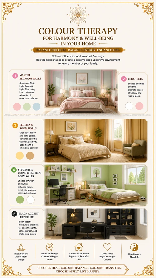
A home’s interior requires distinct color adjustments to match the daily psychological behavior expected in each space:
The Master Suite: Pink is the optimal choice for the master bedroom. It is an incredibly auspicious color that nurtures connection. Light green and light blue are also excellent alternatives, as they are the colors of hope and continuous cultivation.
Bedding Configurations: Plain white sheets or white sheets adorned with soft floral, colorful designs work beautifully. Pink or red sheets and blankets are highly recommended for those looking to get married, as well as for newlyweds desirous of ensuring long-term marital bliss.
The Elderly: Yellow or soft golden-earth tones are ideal for the elderly, providing a sense of tolerance and deep patience.
Young Children: For young children, education and cognitive development are paramount; therefore, a green color palette must be deployed to stimulate brain cell growth.
Furniture Note: Incorporating black accent furniture is highly effective for encouraging deep thoughts, serious concentration, and intellectual depth.
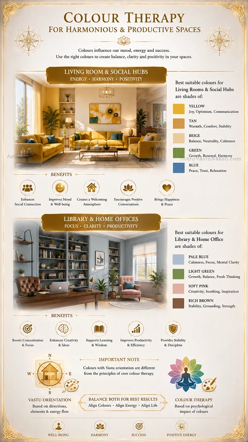
The living room should be a dynamic space full of vibrant colors, rich shades, and diverse patterns. As the primary zone to entertain guests, the living room requires pleasant visual stimuli to keep the environmental atmosphere and conversations lively, diverse, and fluid. The most effective baseline colors here are yellow, beige, tan, green, or soft blue.
The optimal color for a study or library depends entirely on the type of literature the residents consume. If you read serious, analytical, or technical books, rich brown is the most appropriate shade to anchor your focus. For less serious, creative, or casual readers, pale blue, light green, or soft pink provide the perfect lighthearted intellectual environment.
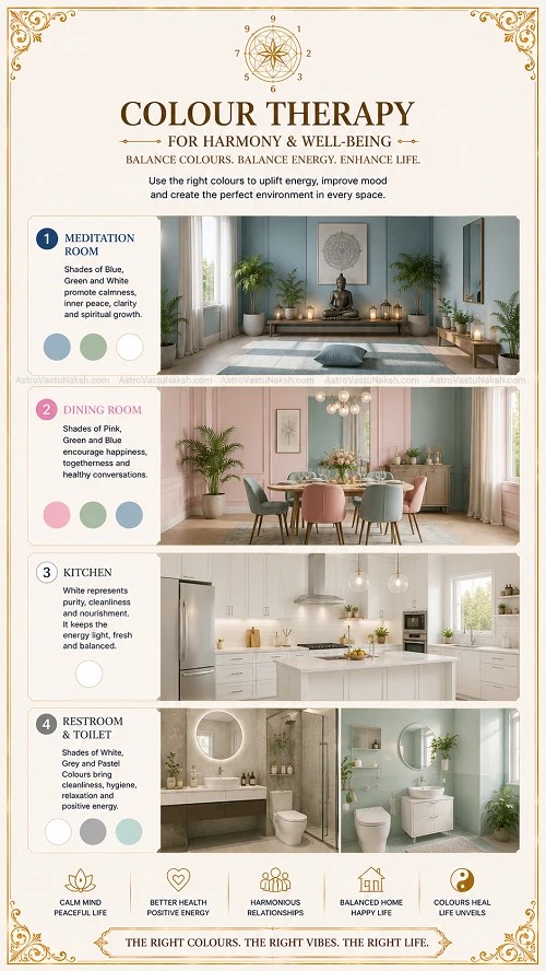
If your floor plan contains a dedicated meditation room or alter, an austere setting is mandatory. Use solid, calm, subdued colors with absolutely zero patterns or distracting designs. Subtle, deep shades of blue, green, yellow, or deep red will naturally encourage deep concentration, internal peace, and profound thought.
Dining Room: The space where the family eats and entertains must be appetizingly colorful. Pinks, greens, and blues are the most effective hues to stimulate digestion and joy. You must completely avoid black, solid white, or a harsh mixture of black and white in this zone, as these frequencies are less conducive to enjoying food.
Kitchen: White is the undisputed best color for a kitchen. It acts as a blank, pure canvas that beautifully shows off the natural colors of food—allowing the cook to create a vibrant meal of red tomatoes, green peppers, and yellow squash. Furthermore, white is the ultimate cosmic color of purity and immaculate cleanliness.
The restroom can be safely painted in clean white or neutral gray to manage the energy of elimination. Soft pink and other light pastel colors are also excellent choices to keep the zone balanced and lightweight.
The exterior colors of a house and the face it presents to the public should be highly uplifting and structurally commanding. The psychological effect of these macro-colors on an observer is immediate, intense, and intuitive. The color and physical condition of a building’s exterior can directly impact the health, reputation, and mood of its inhabitants.
Exterior color schemes should never be limited strictly to outer walls and window frames. The color of your window boxes is a vital element of a building’s facade strategy. The best window box color is one that holds a deliberate, creative relationship with the casing color. To maintain proper spatial depth, the color of the box should always be distinct and different from that of the window casement itself.
Schools, Academic Centers, and Commercial Businesses: Colors full of natural life force—such as rich green, deep blue, bluish-purple, and reddish-purple—actively stimulate the human brain, providing instant access to latent reserves of energy. Deploying these specific frequencies in classrooms and offices helps students and professionals work harder, maintain concentration, and perform under high pressure.
Large Skyscrapers and Commercial Landmarks: For massive commercial properties, the optimal macro-color choices are pure white, rich coffee, gold, brilliant yellow, or deep earth tones. The lower levels and foundation base should ideally be finished in solid white, while the top floors can incorporate green with sharp red accents. This configuration mimics the natural growth of a grand tree laden with fruit, projecting an aura of immense good luck, market stability, and commercial prosperity.
Highways, Roads, and Infrastructure: Roads and roadside colors play a vital role in civic psychology. Highways should ideally feature shoulders and central dividers packed with abundant greenery and vibrant flowers. This environmental stimulus keeps a driver’s mind active, awake, and inspired, drastically reducing fatigue-induced accidents.
From ancient times to the present day, the colors of nature have provided a calming and invigorating stimulus to our bodies and minds. The natural reds, blues, greens, yellows, and whites of trees, flowers, and the open earth help to regenerate your energy, enhancing your speech, emotions, and nervous system.
Today, modern life is complicated, fast-paced, and confusing. Human minds easily become unsettled and weighed down by work, intense daily activities, and societal struggles. When your home or office environment becomes saturated with electronic stress and drab colors, your personal energy matrix stalls.
This is why human beings feel an instinctive need to take regular vacations to rest, travel, and escape to the mountains or the seashore. Your biology needs to see colors it does not normally look at every day to bring balance back to your mind and body. This colorful change is, in its truest sense, the highest form of spatial enjoyment and energetic medicine.
If your walls are currently painted with colors that fight their directional elements, you are living in an environmental friction field. Stop letting your wall paint drain your energy. Book a precise, degree-accurate Colour Vastu consultation today to permanently align your building’s visual frequencies with your life goals.
..who are transforming their lives with our weekly update, Subscribe to our Newsletter today!
Top 10 Critical Vastu Checks For Home The “Dream Home” or a Structural Trap? The Technical Audit of a Lifetime Buying a property is not

7 Horses Painting In Vastu Why Your “Lucky” 7 Horses Painting Might Be Stalling Your Progress In the cluttered world of “Social Media Vastu,” the

Vastu Tips For Toilets In Home Is Your Toilet Flushing Your Wealth and Health Down the Drain? Let’s stop being polite: Your toilet is the

10 Best Vastu Tips For Mandir In Home: Is Your Mandir Radiating Energy or Absorbing It? If you treat your home temple as just another

10 Best Vastu Tips For Kitchen Is Your Kitchen Cooking Your Finances or Your Health? Welcome to the “Agni” pit of your home—the kitchen. While
© All Rights Reserved - www.AstroVastuNaksh.com
All ‘ * ‘ marked fields are mandatory.
Please ensure the form is filled properly, including all mandatory fields.

Please share your details and our team will connect with you regarding your request.